v5.0.0: One CSS, Any Prefix

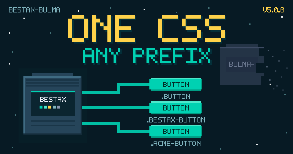
In June, bestax-bulma v5.0.0 shipped exactly one breaking change, and it was a deletion: 3 files touched, 22 lines removed, 0 added. If you never imported versions/bestax-bulma-prefixed.css, you won't feel a thing.
Same housekeeping as the v4 post: this is a recap, not breaking news. v5.0.0 was tagged on June 26, 2026, six days after v4.0.0, and this is the fifth post in the catch-up series. It also brings the recaps up to the present: the library sits at 5.8.0 today, so the back half of this post sweeps 5.1 to 5.8.
The Breaking Change
4.x shipped two prefixed CSS bundles: versions/bestax-prefixed.css (bestax- on every class) and versions/bestax-bulma-prefixed.css (bulma- on every class). Same contents, different prefix. 5.0.0 deletes the bulma- one.
The whole change is package.json, the rollup config, and one fifteen-line Sass file: 22 deletions, 0 insertions.
Both bundles and classPrefix date back to v2. The reason the pair didn't survive, straight from the migration guide: "maintaining two parallel prefixed bundles doubled the prefixed build and test surface without adding capability". Anything the bulma- bundle did, the bestax- bundle or a custom Sass build does.
To be precise about the title: all five CSS variations still ship. What v5 removed is the second prefix scheme. One scheme, bestax-, plus a runtime classPrefix that matches whatever prefix your stylesheet uses. Migrating is a two-line swap:
Before (4.x):
import { ConfigProvider, Button } from '@allxsmith/bestax-bulma';
import '@allxsmith/bestax-bulma/versions/bestax-bulma-prefixed.css';

function App() {
  return (
    <ConfigProvider classPrefix="bulma-">
      <Button color="primary">Save</Button>
    </ConfigProvider>
  );
}
After (5.x):
import { ConfigProvider, Button } from '@allxsmith/bestax-bulma';
import '@allxsmith/bestax-bulma/versions/bestax-prefixed.css';

function App() {
  return (
    <ConfigProvider classPrefix="bestax-">
      <Button color="primary">Save</Button>
    </ConfigProvider>
  );
}
And the rendered HTML moves with it:
<!-- 4.x with bestax-bulma-prefixed.css -->
<button class="bulma-button bulma-is-primary">Save</button>

<!-- 5.x with bestax-prefixed.css -->
<button class="bestax-button bestax-is-primary">Save</button>
If custom CSS overrides or test selectors target .bulma-* names, update those alongside the swap. Miss the swap entirely and the failure is loud: the package export is gone, so the old import dies at build time with ERR_PACKAGE_PATH_NOT_EXPORTED instead of quietly serving an unstyled page. Need to keep the bulma- prefix? It isn't reserved; rebuild the same stylesheet from Sass with $class-prefix: 'bulma-'.
classPrefix itself is unchanged, the same ConfigProvider prop it's been since v2; the configuration guide covers it end to end.
Scaffolding Follows
create-bestax cut 3.0.0 the same day, fixing a bug with the same root cause. Only the complete flavor scaffolded the bundled bestax CSS; the other four imported stock Bulma plus a separate extras.css for the bestax-only components. On the prefixed flavors that combination shipped broken: components emitted prefixed class names while extras.css was unprefixed, so the bestax extras (Tooltip and friends) rendered unstyled in a fresh project.
The fix is the same consolidation: every flavor now imports the single bundled bestax variant for its choice, and the prefixed flavors set classPrefix="bestax-" to match. With one CSS path to wire, the scaffold is correct by construction.
create-bestax is on its 4.x line today, so pnpm create bestax@latest already scaffolds all of this (two minutes to a running app); the installation guide covers the manual path.
Everything Since: 5.1 to 5.8
The major carried one deletion; the minors carried the features. Eight of them in three weeks:
| Release | What Landed |
|---|---|
| 5.1.0 (July 1) | colorMode on Theme: 'light', 'dark', or 'system' |
| 5.2.0 (July 7) | Polymorphic as on the Button API and the Link API; see the routing guide |
| 5.3.0 (July 8) | Reveal, scroll-triggered animations |
| 5.4.0 (July 10) | Avatar, Avatars, and Badge |
| 5.5.0 (July 14) | Accessibility batch for Avatar and Badge |
| 5.6.0 (July 14) | A consistent gap prop on Columns |
| 5.7.0 (July 20) | Dot-notation sub-components across all parent/child families |
| 5.8.0 (July 22) | Agent files in the npm tarball |
Reveal, the avatar family, and the accessibility batch are covered in Enhanced Add-Ons, Round Two, so 5.3 through 5.5 stay one-liners here. One patch is worth a call-out: 5.6.1 routed every hardcoded class name through the prefix helpers and added a sweep test that renders the library under a custom prefix and fails on any class that ignores classPrefix.
Four of the minors deserve more than a row.
Dark Mode on Demand
Since 5.1.0, Theme takes a colorMode prop: 'light', 'dark', or 'system'. It sets Bulma's data-theme on <html>, 'system' follows the OS preference, and omitting it leaves whatever's already set, so single-mode designs should pin it (the Theme docs explain the contrast trap).
import { useState } from 'react';
import { Theme, Button } from '@allxsmith/bestax-bulma';

function App() {
  const [mode, setMode] = useState<'light' | 'dark' | 'system'>('system');
  return (
    <Theme isRoot colorMode={mode}>
      <Button color="primary" onClick={() => setMode('dark')}>
        Dark
      </Button>
      <Button color="primary" onClick={() => setMode('light')}>
        Light
      </Button>
      <Button onClick={() => setMode('system')}>System</Button>
    </Theme>
  );
}
Static on purpose: the blog's live sandbox pins its own light and dark preview, so a toggle that flips the document theme can't run in it. Paste it into an app and it works as written.
One Gap Scale for Columns and Grid
Grid takes gap on Bulma's 0 to 8 scale; Columns wanted gapSize. 5.6.0 gives Columns the same gap prop, plus gapMobile, gapTablet, and the other responsive variants; gapSize still works as a deprecated alias. This one is live:
function GapDemo() {
  const [gap, setGap] = React.useState<0 | 2 | 5 | 8>(2);
  return (
    <Block>
      <Buttons mb="2">
        <Button onClick={() => setGap(0)}>gap 0</Button>
        <Button onClick={() => setGap(2)}>gap 2</Button>
        <Button onClick={() => setGap(5)}>gap 5</Button>
        <Button onClick={() => setGap(8)}>gap 8</Button>
      </Buttons>
      <Columns gap={gap}>
        <Column>
          <Notification color="primary">One</Notification>
        </Column>
        <Column>
          <Notification color="info">Two</Notification>
        </Column>
        <Column>
          <Notification color="success">Three</Notification>
        </Column>
      </Columns>
    </Block>
  );
}
Dot-Notation Sub-Components
Since 5.7.0, every parent/child family hangs its children off the parent: Card.Header, Modal.Card, Navbar.Item, Message.Body, and the rest (#331). The statics are the same components as the named exports (attached, not wrapped), so identity checks like child.type === Modal.Card keep working. If you're coming from react-bulma-components, the shape matches; the migration guide maps the differences.
<Message color="info">
  <Message.Header>
    <Paragraph>One Import, Dot Notation</Paragraph>
    <Delete aria-label="delete" />
  </Message.Header>
  <Message.Body>
    <Paragraph>
      Message.Header and Message.Body ride along on the Message import, so the
      whole family stays in one place.
    </Paragraph>
  </Message.Body>
</Message>
The npm Package Reads Itself
Since 5.8.0, the npm tarball ships llms.txt, AGENTS.md, and a consumer-facing CLAUDE.md (#345). An AI coding agent reading node_modules gets what the library is, where the docs live, and an llms.txt index of what to fetch next, instead of guessing from training data. The LLMs guide covers exactly what ships where.
Documentation
Everything above, in reference form:
- The 4.x to 5.x migration guide: the two-step swap, the rendered-HTML diff, and the keep-
bulma-escape hatch ConfigProviderandclassPrefix, plus the configuration guide- Choosing a CSS variation: which of the five bundles to import
- Theme and dark mode
- The LLMs guide: every AI-facing artifact the project publishes
What's Next
The catch-up series rolls on: next is the agent skills post, then a deep dive on bestax-migrate 1.0. The tracker has the full plan.
One CSS, any prefix. The best thing v5 shipped was a deletion.